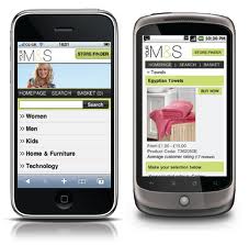
 The increase of mobile Internet use and Smartphone popularity have augmented the importance of designing a specific mobile website. Blackberry, iPhones, iPads, Android, Nokia and other devices can already bring a big part of the traffic to the website, however if the website is not mobile friendly the users might leave as fast as they arrived. The mobile optimized sites are booming and users have become more exigent and expect higher standards while navigating with their devices.
What is very important to realize is that a standard computer screen is not the same as iPhone or Nokia screen and the PC website looks very different in mobile devices. It is essential to take in account the design and lay-out, the legibility and navigation, and the need of fast and efficient download time.
Some examples:
- Size of screen: Screens are smaller and the web content is organized in different way than in the normal webpage. Basically, it is necessary to organize the information in a vertical manner, but still avoid the need for user to slow down.
- Images: All the images in the pages should be correct size and smaller and lighter than in the normal page to allow faster download.
- Connection speed: Your mobile website should be optimized for a fast download and should take in account the lost of connection and other issues related with the connection speed. This especially important for a mobile website that sells products and does not want the user to get worried if the connection fails during the transaction.
- Widgets and plugins: All the additional components, like widgets, plugins and add-ons can slower down your mobile web and the site might not work in all mobiles. For example, the Apple devices are not compatible with flash, so if you are creating a mobile website, avoid Flash and if possible choose the format HTML5.
As always, it is very important not to focus only on technical aspects, but also consider the end-user. More user-friendly the mobile website is, more likely the user is going to come back.
Remember, mobile users want their information fast:
Mobile and PC users have different reasons to visit your page. PC users are more likely to navigate for leisure, while mobiles are usually used in the time of need and users are more likely to want information urgently to help them at that exact time and location. For example, to find timetables, directions or events near-by. Also they might want quick, fast entertainment to fill up the dead moments in the metro or the bus.
Forget always visible top navigation bar and concentrate on content:
Another difference with PC and Mobile sites is that well designed websites respecting usability repeat the navigation bar on every page to facilitate the user journey. However, since mobile screen is smaller, the top navigation pushes the actual content down and users are forced to scroll down on every page. To increase the usability on your mobile website, show the navigation bar only on the homepage and on other pages include just links to the homepage, back to the last important point users have taken (searching dates & cost for example) and next call to action (for example “buy”). These links should be shown at the top and bottom of the page to keep them close.
Highlight the selected items clearly:
It is usually quite difficult to navigate with the mobile phone, because when you move down the page with the joystick or direction buttons it does not only scroll down, but highlights links, buttons and form fields. This makes it hard for users to see, which item is in focus. Changing the appearance of the item by for example showing different font or background colour of the links or buttons makes it stand out from the rest of the items.
Allow users to select instead of having to write:
Having to type on mobile phone can take time, causes errors and is not viewed positively if the user needs information fast. Allowing users to search or input information by selecting certain fields with an easy-to-use dropdowns instead makes the user journey more pleasant. For example, country, region, sity, type of concert, available movies etc.
Only show essential and relevant information:
Mobile phone users have small screens and not much time to go through the website. Therefore, the best way to save their time would be to create a specific url for the mobile website (which users can bookmark) and re-direct the traffic coming through mobiles straight to the mobile optimized site with the most essential features and content. If the mobile website shows the same, long, nicely written content as in the normal site, information is difficult to find and user might have to scroll down to reach the important content. And pay for it. Most of the mobile phone users do not have yet a fixed cost deal for the internet, so downloading useless content might cost them quite a lot.
Do no forget the “Back” button:
Most of the mobile browsers do not show basic control buttons such as “back” to save screen space or they have opted-in to display webpages always in the full screen mode. That is why the site should have buttons or links such as “Back”, “Next page”, “Back to search results” or “New search” at the bottom of each page. Also, all the buttons should be big and easy to press/click. Another trick to use is a clickable phone number “Click to call”, which has shown to increase the CTR.
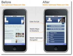 Create mobile-friendly design and lay-out:
As mentioned before, usually layouts created for large landscape PC screens do not work well in small mobile screens and user needs to scroll and scroll…and scroll. In case you only want to tweak your website a bit more mobile-friendly, present the content on the left hand side (such as journey search etc. ) with the most important navigation buttons on the top. However, it is better to have a separate page for mobile users if the site receives a lot of mobile traffic.


I am extremely happy to find this blog.Thanks for having the page! Im sure that it will be extremely popular. It has good and valuable content which is very rare these days.
What a great article. Too often, Managers get caught up in daily routines and forget the basic needs of the consumer and try to make convoluted plans to bring customers in through the doors, but forget what is important to the client. Thank you for simplifying it and keping us focussed.